


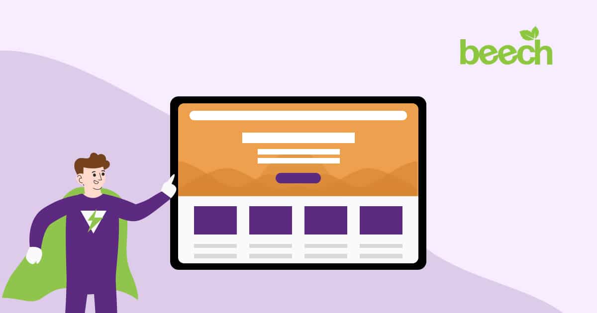
Keep to simple ideas with an eye-catching hero and accessible content per the recommended layout conventions. Also, remember to display the brand as much as possible!
Website design is a huge and constantly evolving topic for many website developers and businesses looking to expand their online reach. There is so much for businesses to think about when creating a website for their digital marketing strategy, and it can be difficult to navigate what’s most important and which principles are most effective.
In this blog post, our website experts have determined five must-know website design principles businesses should consider when creating a website.
Create a simple but effective design

A website’s main job is to persuade visitors to take action. This could include buying a product, requesting a callback, or filling out a contact form.
There are countless ways for visitors to engage with us via our website, but many businesses risk losing their audience’s attention if they give them too much to look at. Business owners should always prioritise the user experience (UX) when designing a new website to avoid confusing website visitors.
The user experience focuses on how website visitors feel when navigating a website and its content. If visitors are overwhelmed by what they see, they may be discouraged from taking action. While it can be tempting to add all available content to a website, hoping to capture the interests of everybody, this approach usually has the opposite effect and puts them off instead.
This is why a simple website design is essential. Our audience will subconsciously equate the experience of being on our website with the experience of working with or buying from us. A complex website filled with outbound links, confusing navigation, long paragraphs of text, and a lack of clear calls to action will give visitors the impression that we could be confusing to work with.
Research shows that 92% of people said a cluttered layout would make them swap to competitors. So, keep it simple!
Did you know? – A simple layout with less unnecessary content can also improve your website’s sustainability. Watch this video to find out more.
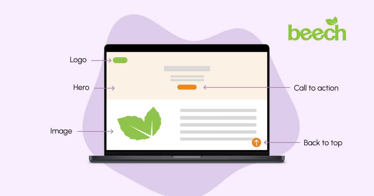
Use the true power of a hero
In a simple website design, we also need a hero.
Called a hero due to its powers of persuasion (no pun intended), this website area is typically the first thing visitors see when they land on a page.
A hero sits at the top of the page, above the point of needing to scroll, and should provide instant confirmation to visitors that they’ve landed in the right place.
The primary role of the hero section on any website or page is to inform people where they are and how the business can help them. Choosing an effective design for this section increases the chance of a website having a good first impression with visitors.
If you’ve ever visited a website and thought, ‘I have no clue what they do’, chances are the hero hasn’t done its job!
A good hero should be:
- Clear and direct about what the business does – there’s no time for subtlety!
- Visually appealing with a relevant, high-quality image, capturing the audience’s attention instantly
- In line with the branding of the site (more on this later)
- Easy to navigate, with a bold heading and call to action for visitors to understand what action they should take
The hero section of a website is arguably the most important part of the design. An eye-catching, functional hero section attracts attention, provides quick information, and suggests the next possible action for visitors. Take the time to design a hero area that stands out to visitors and creates a wonderful experience from the first load.
Look closely at who you’re trying to sell to and the product or service on offer. Is it an event with a sign-up form on the website? Is it a limited-time offer on a piece of equipment sold directly on an e-commerce platform?
By doing this, we can increase the likelihood of conversions by targeting the right audience for our objectives. In reaching the right people, we know that our ads are working efficiently to meet our objectives.
Make website content accessible
We can create a bespoke, well-branded website design that promotes our brand perfectly online…
But if a segment of our audience can’t use it or read any of our content, we’ve missed the mark.
According to data from the World Health Organisation in 2022, around 1.3 billion people experience significant disability. That’s 16% of the entire population!
Business owners have a responsibility to ensure that they’re not isolating these people and losing out on a sizable part of their potential target audience. An accessible website allows us to cater to more people, increases our online reach, and contributes to our brand reputation. It’s also a key ranking factor for Google search engines!
How can we create a website design that is accessible?
Websites should always meet the Web Content Accessibility Guidelines (WCAG) to comply with government accessibility requirements. This means making content perceivable, operable, understandable, and robust for assistive technologies like screen readers.
Here are some ways to achieve this in website design:
- Use alt information correctly – don’t stuff meta information with target keywords!
- Offer alternatives to videos and audio content, such as text-based transcripts
- Structure content in an adaptable way using the correct HTML tags
- Make content easily readable by checking that foreground and background elements have sufficient colour contrast. Also, check that the text is sized appropriately
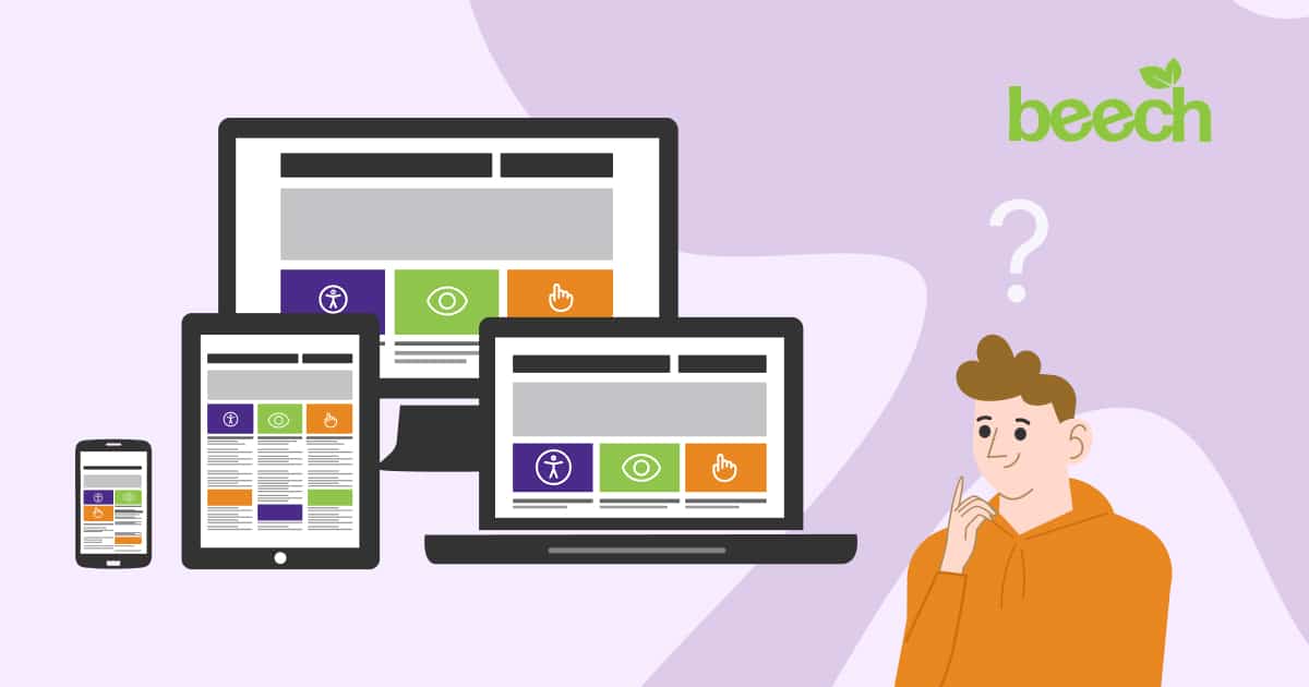
- Create a responsive design that’s device-friendly and is still accessible on various screen sizes
Additional plugins can also provide an accessible experience to users. Check out one we’ve integrated on the Creating Adventures website here.
Follow best-practice layout conventions
Where do you expect to find the main menu when you land on a new website?
Most would expect to see a menu across the top of their screen or in the right corner with an icon often known as a hamburger in the digital marketing industry. But why is that?
When websites were first created and more businesses began incorporating them into their marketing strategy, putting elements like a logo, menu, and contact information in various unique places on a webpage was a fun and exciting way to make a design stand out and appeal to different target audiences.
Many website designers have now discovered the benefits of following a conventional layout adopted by the majority of websites. The human brain relies heavily on mental shortcuts when visiting a website, which frees up the brain to focus on our message.
So, what is the expected layout for most websites?
- A high-quality version of the logo placed at the top left corner or the top middle of a website header
- A menu list or icon in the header at the top of the screen, with all the links easily readable and straightforward to visitors
- A shopping basket appearing in the header or the bottom right corner of a page and set to ‘sticky’ so that it follows the visitor while scrolling
- Text content is left aligned for faster reading.
Using these familiar layout conventions will also help a business follow our first tip in creating a simple website design that visitors can feel confident navigating.
Don’t forget branding!
Following the tips above, businesses will have a website design that is simple, easy to understand, and accessible to their target audience. They will also use layout conventions and key design elements to improve their user experience. If all business owners created their websites this way, they would all look similar.
What makes each website unique? Branding!
According to Forbes, it’s estimated that 175 websites are created every minute worldwide. That’s approximately 252,000 daily. With so many websites out there and businesses taking advantage of new online marketing opportunities, branding is essential.
A website is the one place online where we can genuinely have creative control. This includes everything from logo positioning to colour schemes, font choices, functionality, and more. By utilising branding elements throughout a website, we can create a cohesive experience for visitors from the second they land on our homepage.
This also makes us more likely to be remembered. Further research from Forbes suggests that 82% of people click on a product by a brand they recognise before any other option, and 71% of people will make more purchases from a brand they trust. Using branding consistently and cohesively across a website design will help visitors recognise a business amongst competitors and trust them.
Read this blog post to learn more about integrating branding in website design.
Create a website design for your business that you love
Using the tips we’ve mentioned, businesses can create a website they’re proud of, not one they’re ashamed to direct their customers to.
If you’d like to create a bespoke design for your business, contact us today!