


A good website design is made up of the following key things:
- Easy navigation that creates clear pathways for visitors to find exactly where they need to go
- Responsive design that ensures a website looks perfect on phones, tablets, and computers
- Accessibility elements that make a website welcoming and usable for everyone, including people with disabilities
- Search Engine Optimisation (SEO) that helps search engines understand and recommend a website in results
- Audience-appropriate design that’s tailored to visitors
When landing on a website for the first time, does it make you feel at home or completely lost?
According to research, it only takes 0.05 seconds to make a first impression, meaning the initial reaction from visitors can be a make-or-break for organisations, and it all comes down to website design.
Great web design isn’t about looking pretty – though it certainly helps. Instead, it’s about creating an experience that feels natural, welcoming, and easily gets the right people to where they need to go.
Think of a website like a digital front door. It must be welcoming, and just as we’d want visitors to easily find their way around our home and feel comfortable there, a website design should guide people effortlessly and make them want to stick around.
In this blog post, we’re breaking down five key elements that make a good website design for brands and their visitors.
If you’re looking for advice on website content specifically, read this blog about optimisation from our website.
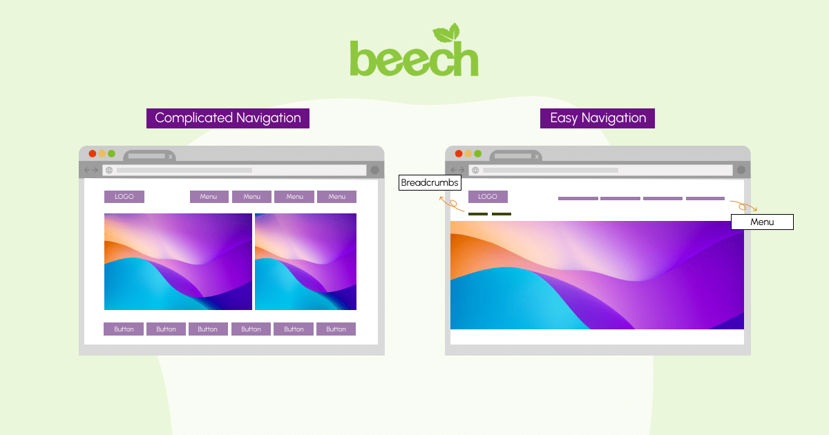
Web design with easy navigation that makes sense
Imagine walking into a store where nothing is priced, the aisles go in random directions, and there’s no one around to help. How frustrating would that be?
It’s exactly how visitors feel when a website has confusing navigation.
What Makes Navigation Work?
Good website design puts navigation front and centre, making it crystal clear how to navigate content. A main menu should point visitors in the right direction, not make them click away.
Here are our tips when creating a menu:
- Keep menu links short, simple and use non-technical language that audiences will understand
- Avoid overfilling a menu with every single link on your website. Keep to the key pages we want visitors to instantly click on.
- Use descriptive labels that tell people exactly what they’ll find, rather than a generic term that provides no context for the page.
- Use sub-menus to categorise pages and help visitors find related content
- Use hover effects that tell the visitor instantly a link is clickable.
Breadcrumbs help with page location (and SEO)
If you’ve ever shopped on your favourite online store and saw something that looks like this:
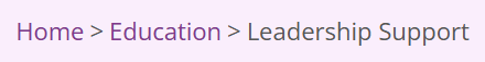
Then you’ve seen breadcrumbs!
Breadcrumbs are a series of links that show users their current location within the website’s structure, typically displayed at the top of a page. They provide a clear navigation path for users, helping them understand the site’s structure and easily move between pages, which can reduce bounce rates. It also helps them navigate back to a page they previously visited.
They’re also beneficial for SEO because they improve the user experience, as suggested by Search Engine Journal and a website’s crawlability and indexability. For search engines, breadcrumbs act as internal links, making it easier for crawlers to discover and index pages.
Responsive website design that’s no longer optional
A study in May 2025 from Exploding Topics found that people using mobile devices contribute to 64.14% of all website traffic, and 96.3% of internet users are using a mobile phone.
With that in mind, designing a website in a responsive, adaptable way isn’t really a choice!
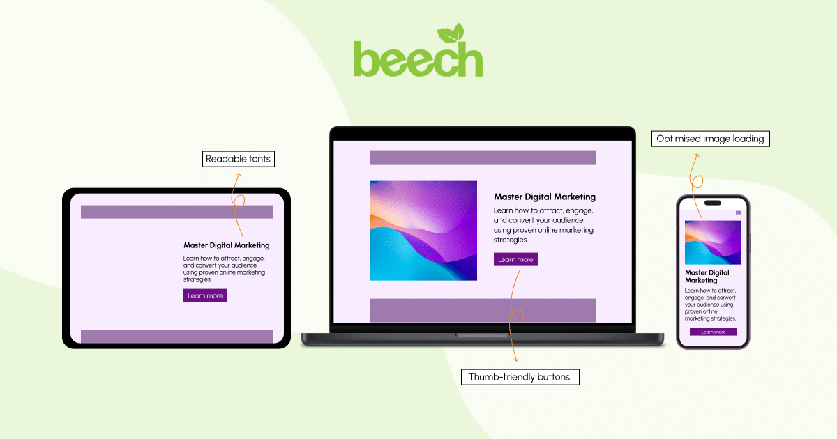
Responsive design means having a website that adjusts automatically to the screen it’s being viewed on. This includes resizing imagery, changing the layout of content, and adjusting font sizes for optimal readability.
It also means considering how much content is on one page, as it’ll take longer for visitors to scroll through when there’s not as much on screen at any given time.
Key things to remember when creating a responsive website
For every website, creating a responsive design is about understanding what the visitor will see and how they will interpret content. A responsive website should always:
- Be readable (take away the need for those awkward zoom-ins and screen pinches when someone views a page).
- Be easy to interact with. Check buttons and calls to action are clear and clickable with thumbs as much as they would be with a cursor. Use the tap targets suggested by Google for help with this.
- Load quickly. Avoid large image and video files that will create a slow, lagging user experience, and optimise code. This also has sustainability benefits, as shown in one of our recent YouTube videos.
- Avoid too much scrolling. Smaller devices, especially, will lead to longer content and more scrolling for visitors. Reduce the length of paragraphs, decrease image sizes and add sticky navigation menus that make the viewing experience as easy as possible.
The best part about responsive website design? When your website design works seamlessly across devices, Google says that it does notice, and rewards you with better search rankings.
Organisations that have a responsive design aren’t only keeping their visitors happy; they’re also impressing in search results. It’s worth it!
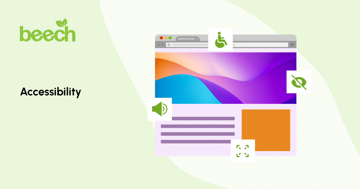
Accessible website design for everyone
The World Health Organisation in 2022 reported that around 1.3 billion people experience significant disability, equivalent to 16% of the entire population!
Great website design welcomes everyone through the door, including people who experience the internet differently to someone without disability.
Creating an inclusive experience isn’t only about catering to specific people, it’s about ensuring our content will be digestible and understandable in all aspects.
So, how do we make a website accessible?
Accessibility features make the user experience of a website better for everyone, including those who rely on them to browse the internet.
Some features and methods to follow when making a website accessible include:
- Adding Alt text for screen readers (It’s also great for SEO!)
- Ensuring good colour contrast on every element of each page (This checker from Level Access can help with this)
- Structuring content in a way that’s easy to understand
- Offering alternatives for media-based content like images and videos, such as a transcript or on-screen captions.
We cover these methods in detail in a previous blog post, which discusses key website principles.
These fixes are easy to implement and are thoughtful design decisions that show care for all visitors.
Plus, accessible website design often improves your search engine rankings too, since many accessibility practices align with what search engines look for.

Search Engine Optimisation (SEO) that works for web design
Search Engine Optimisation (SEO) might sound technical, but it’s really about making website design friendly to search engines like Google.
Using the right SEO techniques, we can help Google understand what our website is about, which then helps it to match us to the right people searching for what we’re looking for and show our audience our relevant content.
How to incorporate SEO into website design?
Create content that connects with visitors, without overwhelming them.
Good website design naturally incorporates SEO without making it feel forced. This means using clear, descriptive headings that tell both visitors and search engines what each section covers, adding context to the page and the content that helps build a clear image of the brand.
When content is written to help people and answer their questions, search engines take notice. Rather than keyword stuffing, which SEMrush has deemed an outdated and often punishable technique to search engines like Google, offer simple, easy-to-understand content that showcases a brand in the best way possible.
For the technical elements, think about:
- Making sure pages load quickly (nobody likes waiting around)
- Using descriptive website URLs that make sense
- Organising content in a logical, easy-to-follow way with clear headings and subheadings, sections for specific content and easy-to-spot calls to action
- Adding proper page titles and descriptions to every page
Also, make sure to speak to the audience directly. Ask, ‘What would I search if I were looking for this organisation?
After all, a user might search for “fresh bread near me” rather than “artisanal baked goods establishment”, so any website design should speak their language first.
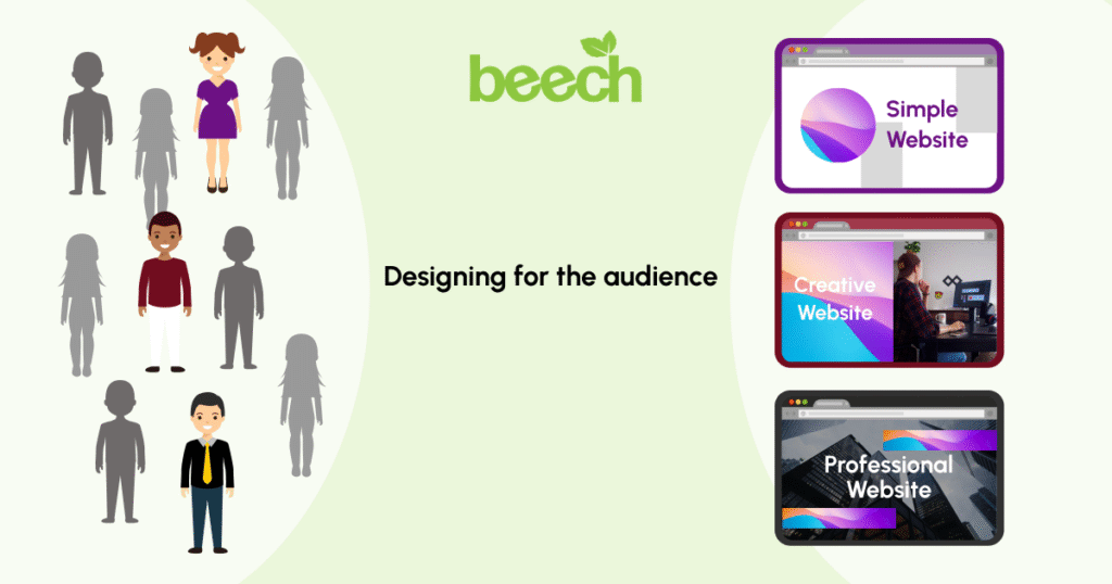
Designing for the audience first
Everything comes down to the visitors on a website. If they don’t receive the design well, it won’t serve its intended purpose – to convert.
Understanding the audience will help organisations in shaping every website design decision, including:
- The colours chosen
- The keywords, phrases and languages used
- How much information to include on each page
- How to talk to them. Is the language formal, conversational or persuasive?
- What’s on offer, and how visitors can access these offerings
- Their goals and what they’re looking to achieve from visiting the website.
If visitors are busy professionals looking for quick answers, the website design should be clean and efficient. If we’re targeting creative types who love to explore, we could include more visual elements and interesting interactions.
Smart website design accommodates these different preferences without making anyone feel rushed or overwhelmed.
When visitors feel understood and valued, they’re much more likely to stick around, engage with content, and eventually become customers.
In Summary
Great website design is about creating an experience that feels effortless and enjoyable for customers.
When we combine easy navigation, responsive design, accessibility, SEO, and audience awareness, we can create a website that works efficiently for both brand and visitor alike.
Remember, website design is often the first impression people have of an organisation. Make it count by focusing on what matters most: helping visitors accomplish their goals while feeling good about the experience.
The rest will follow naturally.
Looking for help creating a new design for your website? Talk to our team today.